
ExhibitingChaos withExcel!
For popular science purposes, the advantages of using Excel to demonstrate chaos are obvious: first, Excel is a “household” piece of software, installed on almost every computer, so there is no need for users to specially download fractal software; it is right there at hand. Moreover, Excel is idiot-proof to operate and requires no programming skills whatsoever. At the same time, Excel makes it very easy to generate graphics, and converting them into images, Word documents, PPT files, web pages, and so on is all very convenient. For those encountering fractals for the first time, hands-on operation with Excel is obviously the most direct way to experience them.
When drawing relatively simple patterns, Excel is quite convenient to use. Take the original form of the “king map” as an example:
x_(n+1)=sin(by_n)+csin(bx_n),
y_(n+1)=sin(ax_n)+dsin(ay_n),
First, enter the values of a, b, c, d, x0, y0 in order into the cells of the first row of a blank Excel worksheet; for example, fill A1, B1, C1, D1, E1, F1 with -1, 3, 0.7, 0.7, 0.1, 0.1 respectively.
In the first four cells of the second row, that is, directly below the constants, enter “=A1”, “=B1”, “=C1”, “=D1” in order; the advantage of doing this is that it makes it easy to change the constants frequently.
In the last two cells of the second row, namely E2 and F2, enter the first recurrence formulas for x_n and y_n:
That is, in E2 type “=SIN(B2*F1)+C2*SIN(B2*E1)”—note that B2 and C2 here are equal to b and c respectively.
In F2 type “=SIN(A2*E1)+D2*SIN(A2*F1)”.
Then select the 6 cells in the second row, move the mouse to the lower-right corner of the selection box, and when the pointer turns into a cross, hold down and drag straight downward. You can drag it to 10,000 rows or even more, up to 65,536 rows. The dragging speed is very fast; when finished, press ctrl+Home to conveniently return to the first row.
Select columns E and F, and click the “Chart Wizard” button on the standard toolbar, or “Insert” menu—“Chart”.
Choose “XY Scatter Plot” and simply press Enter or click “Finish”!
The default chart that is generated is not visually ideal; drag the chart border to enlarge it (you might as well stretch it to hundreds of rows long), then change the window zoom ratio (for example, while clicking any cell, hold ctrl and scroll the mouse wheel) until it looks right.
Right-click in the chart and choose “Chart Options” to remove unnecessary gridlines, the X-axis, Y-axis, legend, and so on. Double-click the background to remove the background color, or choose an appropriate color; double-click any data point to adjust its size, shape, and color.
The pattern is thus complete!
Next you can adjust the constants a, b, c, d and the initial values of x, y to observe the changes in the pattern; you only need to operate in the first row.
In other words, once the corresponding values of a, b, c, d, x0, y0 in the first row are changed, the entire data table and the generated pattern will change instantly!
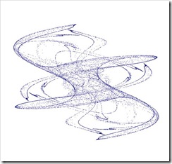
Below is the pattern I generated using the above method (more than 30,000 points in total)
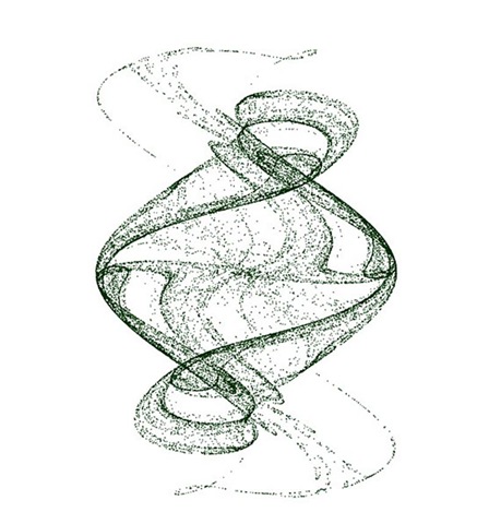
Changing the constants can yield completely different patterns! For example, if the first row is changed to -1.05, 2.29, 1, -1, 0.1, 0.1, the following image is obtained:
April 28, 2006
Exhibiting Chaos with Excel: Supplement—Transformer & Three-Wing Eagle
Xingding posted on 2006-04-28 20:48:55
———————————————————————————————
Re-entered according to the original text
Original version of the philosophy-of-science/technology assignment:
Inspired by classmate Chen Xingqun, I grasped the technique of using Excel to demonstrate chaos; it is extremely handy, so I gave it a try~
He did the first problem, and I then did the second: in addition, I made some king-map and other figures.
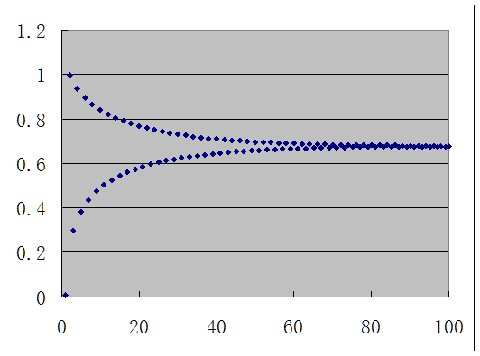
Xn+1=μXn(1-Xn)
When μ is roughly between (0, 0.75), taking any initial value gives period 1.
Below I take μ=0.7, X1=0.01 as an example of the graph:
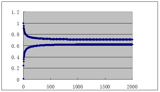
When μ is roughly between (0.75, 1.25), period 2 is obtained.
Below is the graph for μ=0.751, X1=0.01:
Here is another example, μ=1.2, X1=0.01:
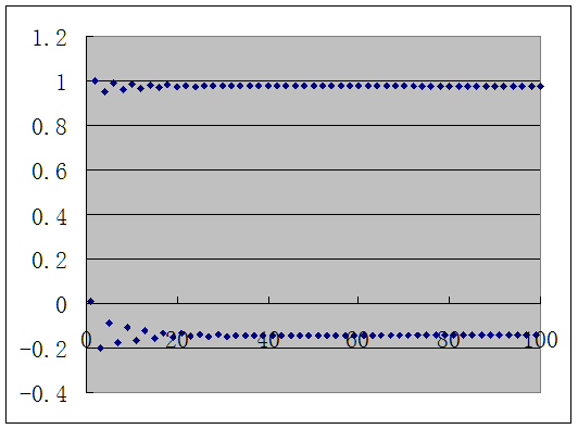
When μ is roughly between (1.25, 1.37), period 4 is obtained.
Below is the graph for μ=1.3, X1=0.01:
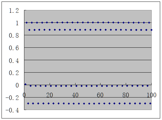
When μ is roughly between (1.37, 1.4), the period begins to become complicated.
Below is the graph for μ=1.4, X1=0.01:
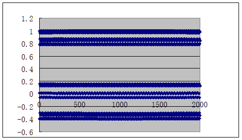
When μ is roughly between (1.4, 2), chaos appears!
Below is the graph for μ=2, X1=0.01 as an example—below are views taken at X100 and X10000 respectively:
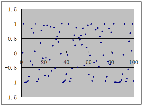

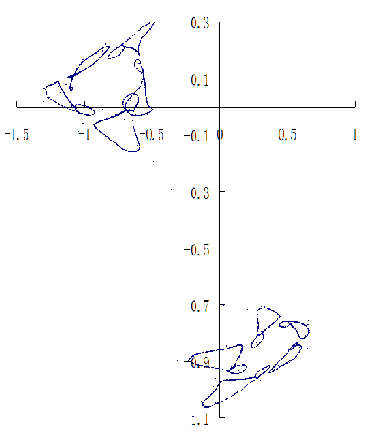
In addition, using Excel, as long as you list two sets of recursive sequences at the same time and use the “scatter plot with smooth lines and no data points,” you can also draw a two-dimensional chaos graph. For example, if you write the recursive formula in this problem with a one-step offset, namely point A_n=(Xn, Xn+1), you can obtain a pattern like the one below:

By this method, one should be able to create even more complex patterns with programming.

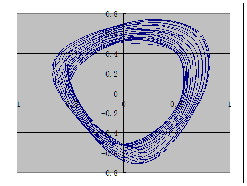
The following image is generated by
Xn+1=1-aXn2+Yn,Yn+1=bXn,X1=Y1=1,a=0.1,b=1
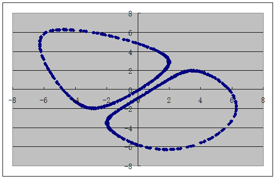
The following image is generated by
Xn+1=1-aXn2+Yn,Yn+1=bXn,X1=Y1=0.5,a=0.134,b=1
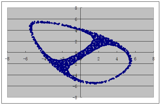
The following image is the graph for Xn+1=sin(bYn)+csin(bXn),,Yn+1=sin(aXn)+dsin(aYn),a=-1.5,b=2.6,c=0.86,d=0.75,X1=Y1=0.5 (10,000 points):
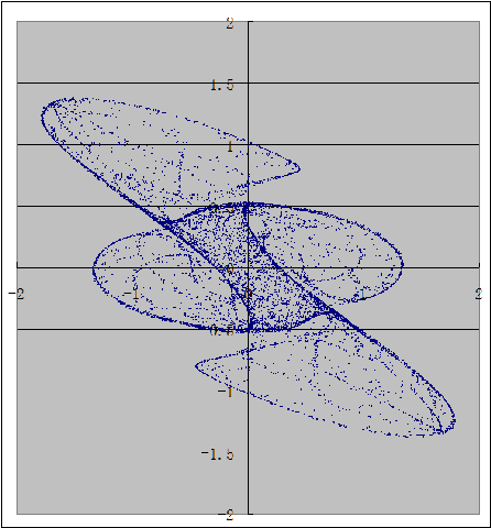
The following image is the graph for Xn+1=sin(bYn)+csin(bXn),,Yn+1=sin(aXn)+dsin(aYn),a=-1,b=3,c=0.7,d=0.7,X1=Y1=0.1 (10,000 points):
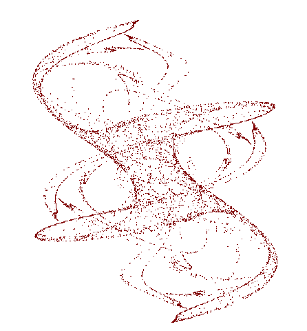
Xn+1=sin(aYn)-zcos(bX n),
Yn+1=zsin(cXn)-cos(dY n),
Zn+1=esinXn.
Here, when a=2, b=3.281, c=-0.5975, e=0.6666, X0=1.41, Y0=2, Z0=1, the pattern of (X, Y) (10,000 points)
Exhibiting Chaos with Excel! (Expanded Edition)
For popular science purposes, the advantages of using Excel to demonstrate chaos are obvious: first, Excel is a “household” piece of software, installed on almost every computer, so there is no need for users to specially download fractal software; it is right there at hand. Moreover, Excel is idiot-proof to operate and requires no programming skills whatsoever. At the same time, Excel makes it very easy to generate graphics, and converting them into images, Word documents, PPT files, web pages, and so on is all very convenient. For those encountering fractals for the first time, hands-on operation with Excel is obviously the most direct way to experience them.
When drawing relatively simple patterns, Excel is quite convenient to use. Take the original form of the “king map” as an example:
x_(n+1)=sin(by_n)+csin(bx_n),
y_(n+1)=sin(ax_n)+dsin(ay_n),
First, enter the values of a, b, c, d, x0, y0 in order into the cells of the first row of a blank Excel worksheet; for example, fill A1, B1, C1, D1, E1, F1 with -1, 3, 0.7, 0.7, 0.1, 0.1 respectively.
In the first four cells of the second row, that is, directly below the constants, enter “=A1”, “=B1”, “=C1”, “=D1” in order; the advantage of doing this is that it makes it easy to change the constants frequently.
In the last two cells of the second row, namely E2 and F2, enter the first recurrence formulas for x_n and y_n:
That is, in E2 type “=SIN(B2*F1)+C2*SIN(B2*E1)”—note that B2 and C2 here are equal to b and c respectively.
In F2 type “=SIN(A2*E1)+D2*SIN(A2*F1)”.
Then select the 6 cells in the second row, move the mouse to the lower-right corner of the selection box, and when the pointer turns into a cross, hold down and drag straight downward. You can drag it to 10,000 rows or even more, up to 65,536 rows (but when plotting, at most only 32,000 data points can be used). The dragging speed is very fast; when finished, press ctrl+Home to conveniently return to the first row.
Select columns E and F, and click the “Chart Wizard” button on the standard toolbar, or “Insert” menu—“Chart”.
Choose “XY Scatter Plot” and simply press Enter or click “Finish”!
The default chart that is generated is not visually ideal; drag the chart border to enlarge it (you might as well stretch it to hundreds of rows long), then change the window zoom ratio (for example, while clicking any cell, hold ctrl and scroll the mouse wheel) until it looks right.
Right-click in the chart and choose “Chart Options” to remove unnecessary gridlines, the X-axis, Y-axis, legend, and so on. Double-click the background to remove the background color, or choose an appropriate color; double-click any data point to adjust its size, shape, and color.
The pattern is thus complete!
Next you can adjust the constants a, b, c, d and the initial values of x, y to observe the changes in the pattern; you only need to operate in the first row.
In other words, once the corresponding values of a, b, c, d, x0, y0 in the first row are changed, the entire data table and the generated pattern will change instantly!
Below is the pattern I generated using the above method (more than 30,000 points in total)
2006-04-28
![clip_image004[4]](https://yilinhut.net/wp-content/uploads/2011/02/clip_image0044.jpg "clip_image004[4]")
Changing the constants can yield completely different patterns! For example, if the first row is changed to -1.05, 2.29, 1, -1, 0.1, 0.1, the following image is obtained:
![clip_image006[4]](https://yilinhut.net/wp-content/uploads/2011/02/clip_image0064.gif "clip_image006[4]")
Now let’s look at a very interesting pattern—the ZZSUC map (though I couldn’t produce the pattern I had in mind; perhaps I made a mistake, but what I ended up with is also quite fun~~):
x_(n+1)=(x_n+Ksiny_n)cos(2π/q)+y_nsin(2π/q)
y_(n+1)=-(x_n+Ksiny_n)sin(2π/q)+y_ncos(2π/q)
Enter the initial values of K, X0, Y0, q in the first row in order.
In the second row, enter in order “=A1”, “=(B1+A2*SIN(C1))*COS(2*PI()/D2)+ C1*SIN(2*PI()/D2)”, “=(B1+A2*SIN(C1))*SIN(2*PI()/D2)+ C1*COS(2*PI()/D2)”, “=D1”, and, following the method above, make charts for columns B and C.
We take X0=-1, Y0=1.
q is an integer from 3 to 6.
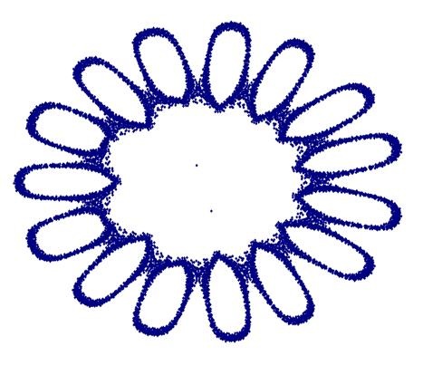
Note that the generated figure is extremely sensitive to K. Below are the patterns for q=4 and K equal to 1.667, 1.667000000001, 1.667000000002, and 2.05 in sequence (10,000 points):
![clip_image010[4]](https://yilinhut.net/wp-content/uploads/2011/02/clip_image0104.gif "clip_image010[4]")
![clip_image012[4]](https://yilinhut.net/wp-content/uploads/2011/02/clip_image0124.gif "clip_image012[4]")
![clip_image014[4]](https://yilinhut.net/wp-content/uploads/2011/02/clip_image0144.gif "clip_image014[4]")
![clip_image016[4]](https://yilinhut.net/wp-content/uploads/2011/02/clip_image0164.gif "clip_image016[4]")
We can see that, as K is continuously adjusted, the q=4 pattern is just like playing with “Transformers,” changing in endlessly varied ways—the shape of the fourth picture is simply like a Transformer!! As the parameter value keeps being adjusted, that “Transformer” can even turn into an airplane (2.0499999999)!
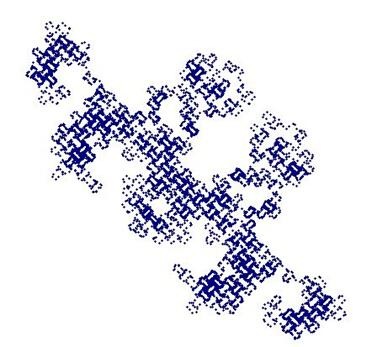
![clip_image020[4]](https://yilinhut.net/wp-content/uploads/2011/02/clip_image0204.gif "clip_image020[4]")
But it should be pointed out that the shape changes seen here are, in a sense, only an illusion, because their shape is directly related to the number of points taken; it seems that the more points you take, the more this map will extend across the entire plane. Below, I color the last 5000 data points of that Transformer in another color (this is also done with Excel, just by adding one more row of data so that after 5000 rows it becomes “=Bi”
![clip_image022[4]](https://yilinhut.net/wp-content/uploads/2011/02/clip_image0224.gif "clip_image022[4]")
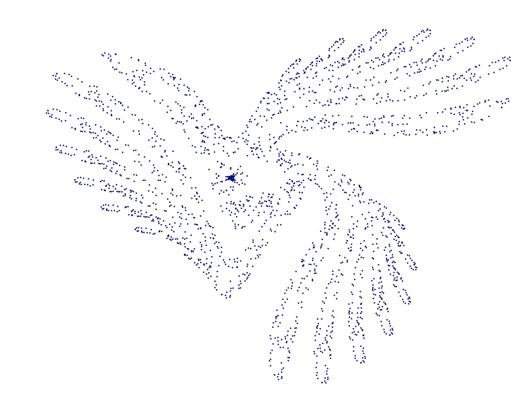
Finally, let’s do the legendary “Three-Wing Eagle map”:
I enter the following into A1~G1 of the first row in order:
1,1,-0.6,0.95,=2-2*C1,=C1*A1+E1*A1*A1/(1+A1*A1),=A1
In A2~H2 of the second row, I enter in order:
=D1*B1+F1,=F2-G1,=C1,=D1,=2-2*C2,=C1*A2+E1*H2/(1+H2),=A2,=A2*A2
Then, following the previous method, drag the second row down to tens of thousands of rows and chart columns A and B:
The first two cells of the first row are respectively the initial values of X and Y; adjusting them has almost no effect, while C1 and D1 are constants, and adjusting them will have a dramatic effect on the pattern.
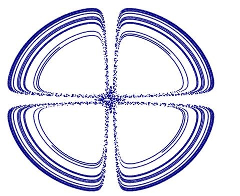
Below are the Three-Wing Eagle map pattern and several variants of it:
![clip_image024[4]](https://yilinhut.net/wp-content/uploads/2011/02/clip_image0244_thumb.gif "clip_image024[4]")

Translated from the Chinese original with AI assistance. The original text is authoritative.